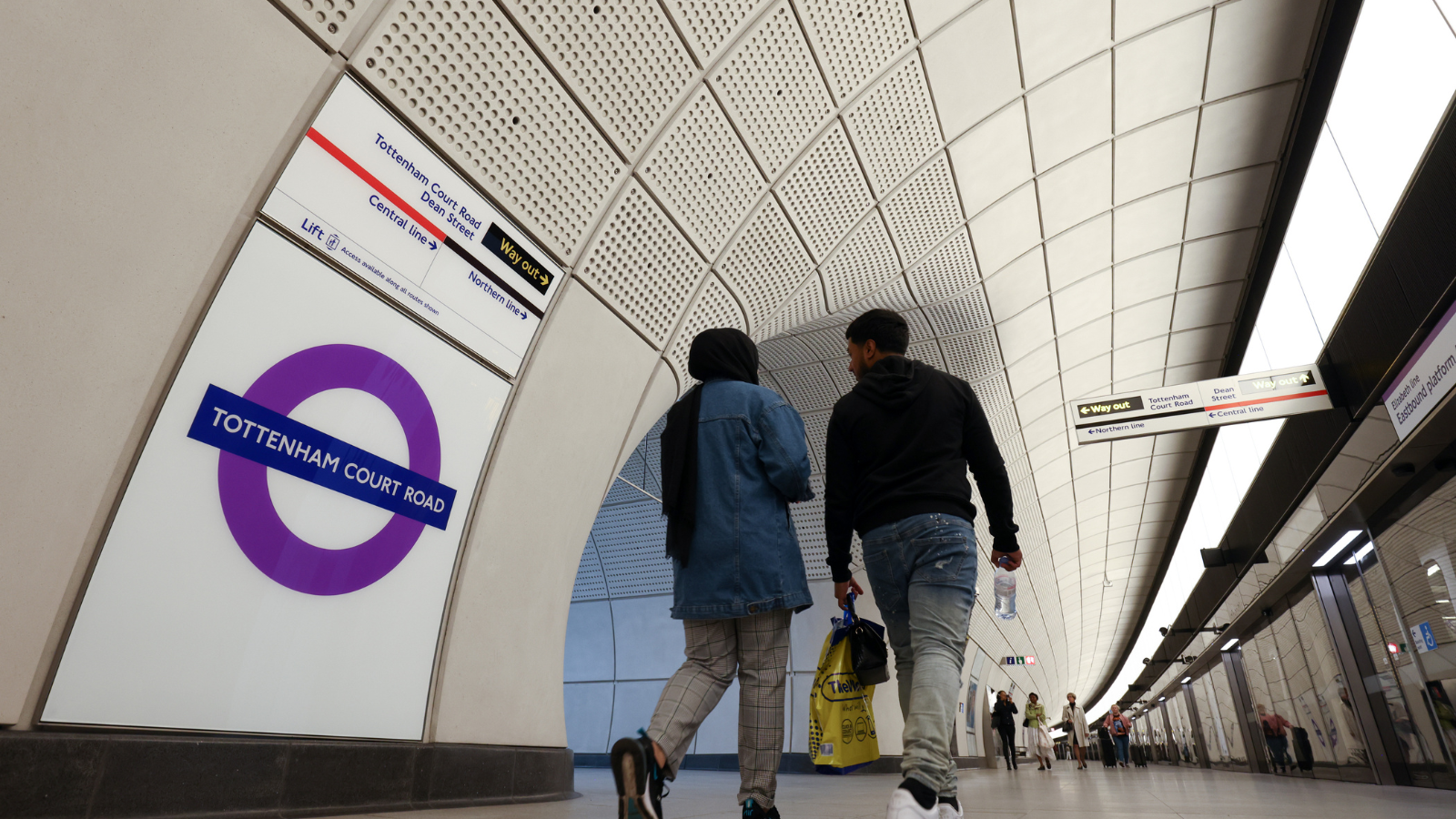
You may be aware that TFL provided a public dashboard from which users could view pan-London and local statistics for Tube station entries and exits and London-wide bus service demand. A B2B version of this dashboard enabled that data to be exported.
Earlier this year they paused updating the public version of this dashboard to make improvements. This is now available again with a dedicated link.
The new version of the public dashboard provides:
- Journeys by mode (Tube / Bus) – the daily aggregate trips made by either mode across London since 1 January 2019
- Taps by station: entry and exit charts, with additional filters to show stations by line, section of line (possibly less relevant to you), single stations, day of the week and entry / exit filters to limit data shown to either or all of these taps
- Year on Year Rail Taps – comparative charts which allow you view data by 2019, 2021, 2022 and 2023, and how entries and exits have changed over recovery. On this page you can view the data by rail line, rail section, single station, by borough area and by day of the week.

